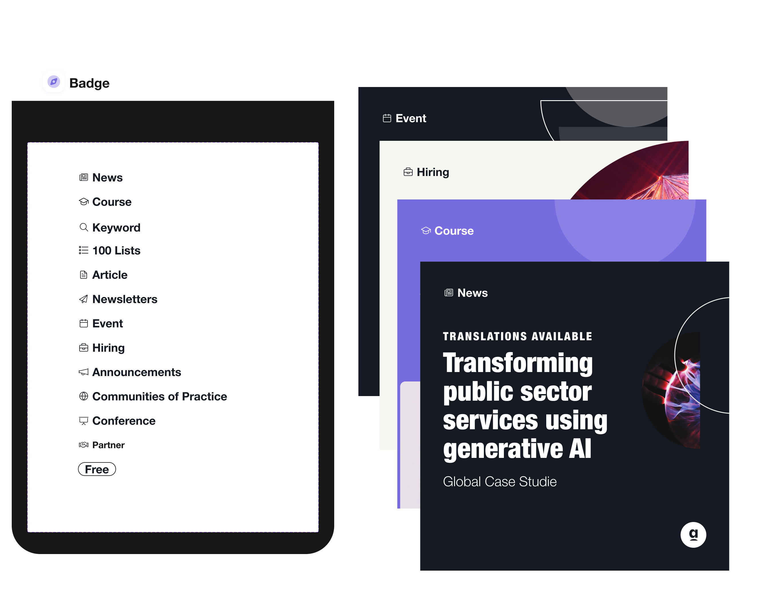
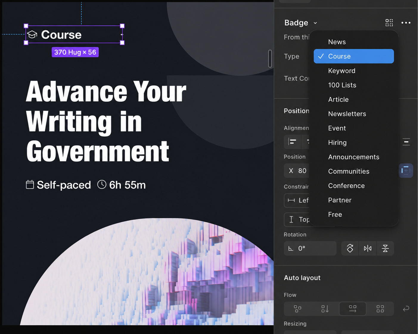
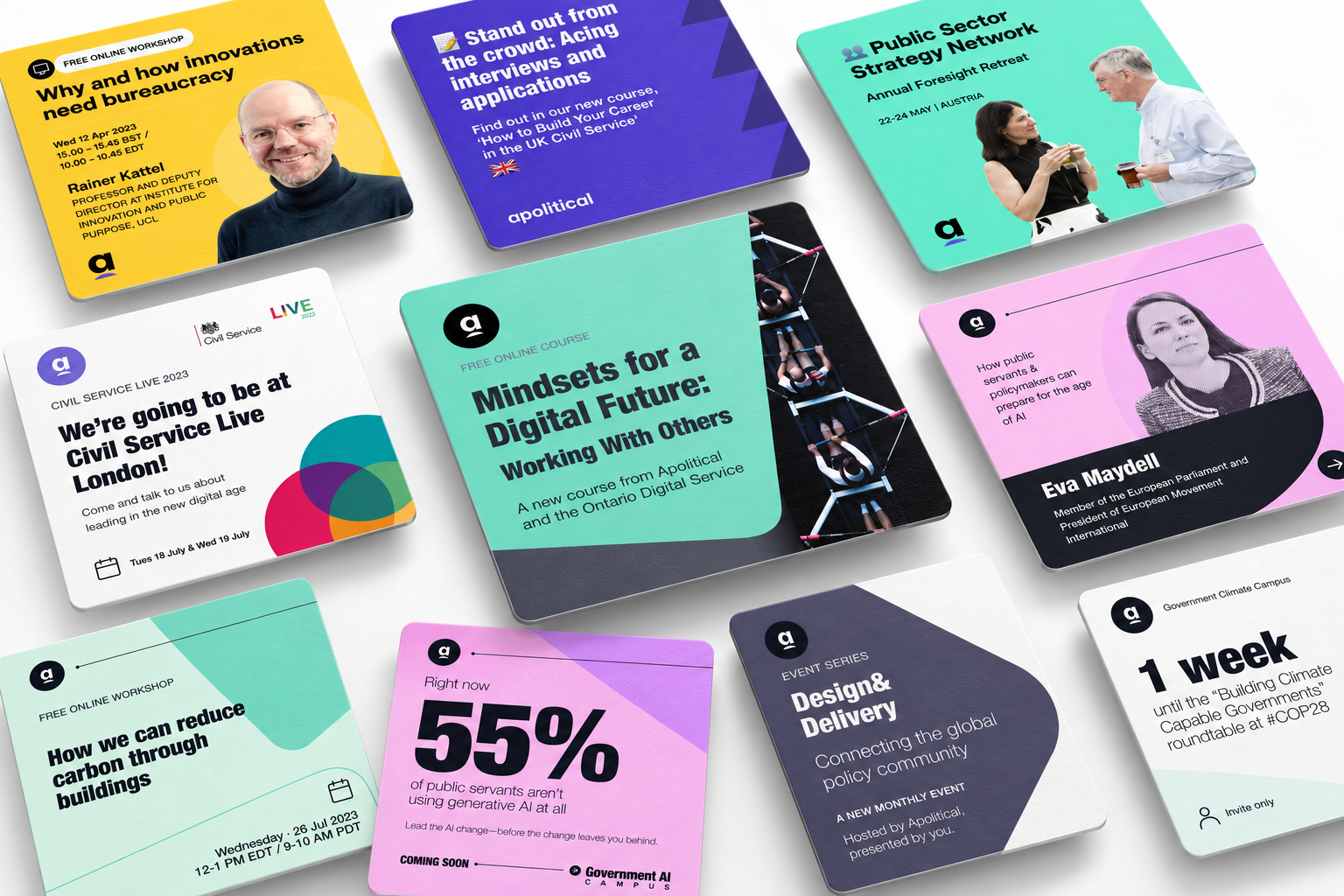
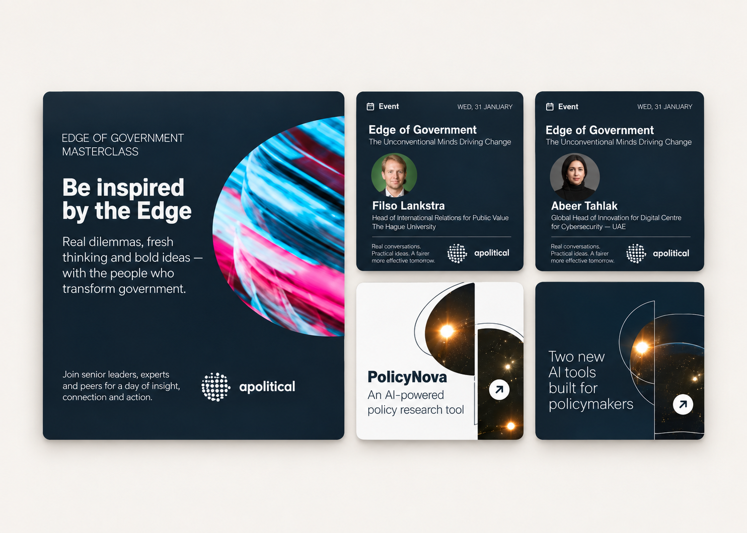
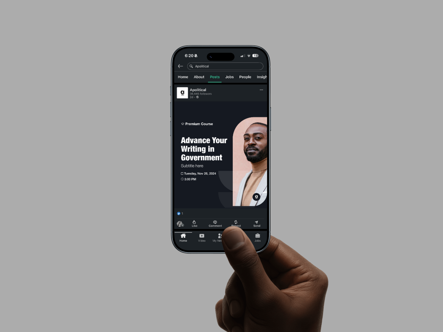
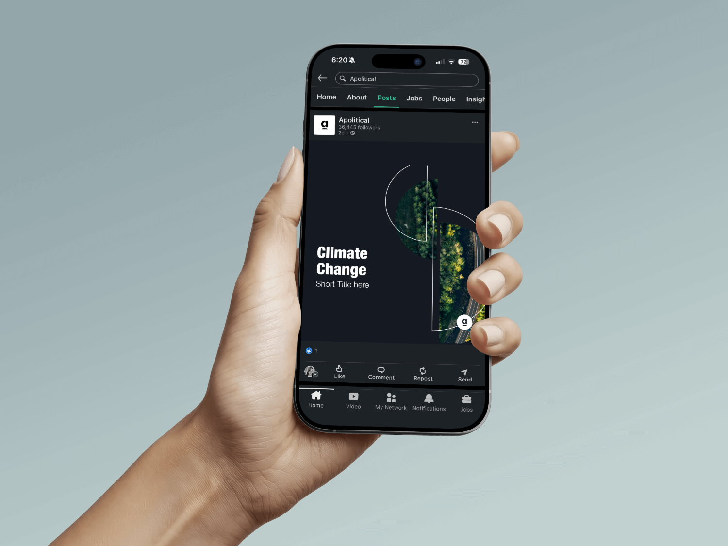
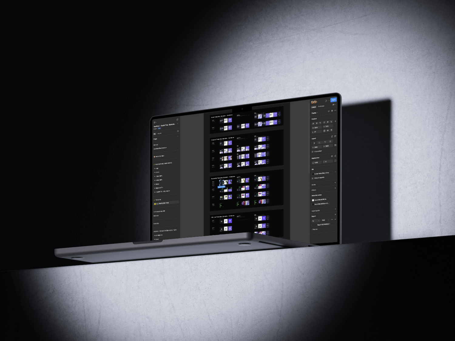
Instead of delivering a set of static templates, I built the system around a proper component library: a foundations layer covering Logo, Colors, Typography, Iconography, Badge, Signature Tile, and LinkedIn Tile, with master components reused as instances across 934 individual placements throughout the templates. Updating a master component propagates that change across the whole system.
Since the people actually using this day to day were non-designers, the library ships with governance built directly into the file. There's a dedicated Foundations page documenting how components and instances relate, why deleting a master component breaks every instance built on it, when to use "Detach Instance" for one-off exceptions, and naming conventions to keep the library organized as it grows. That's what turns the library into a real single source of truth the marketing team can rely on without needing a designer to step in.
The system also includes an onboarding layer, a "Get Started" page explaining what the file is for and how to use it, which doubled as a bridge between the agency and the client's marketing team, keeping both sides working off the same assets and process.
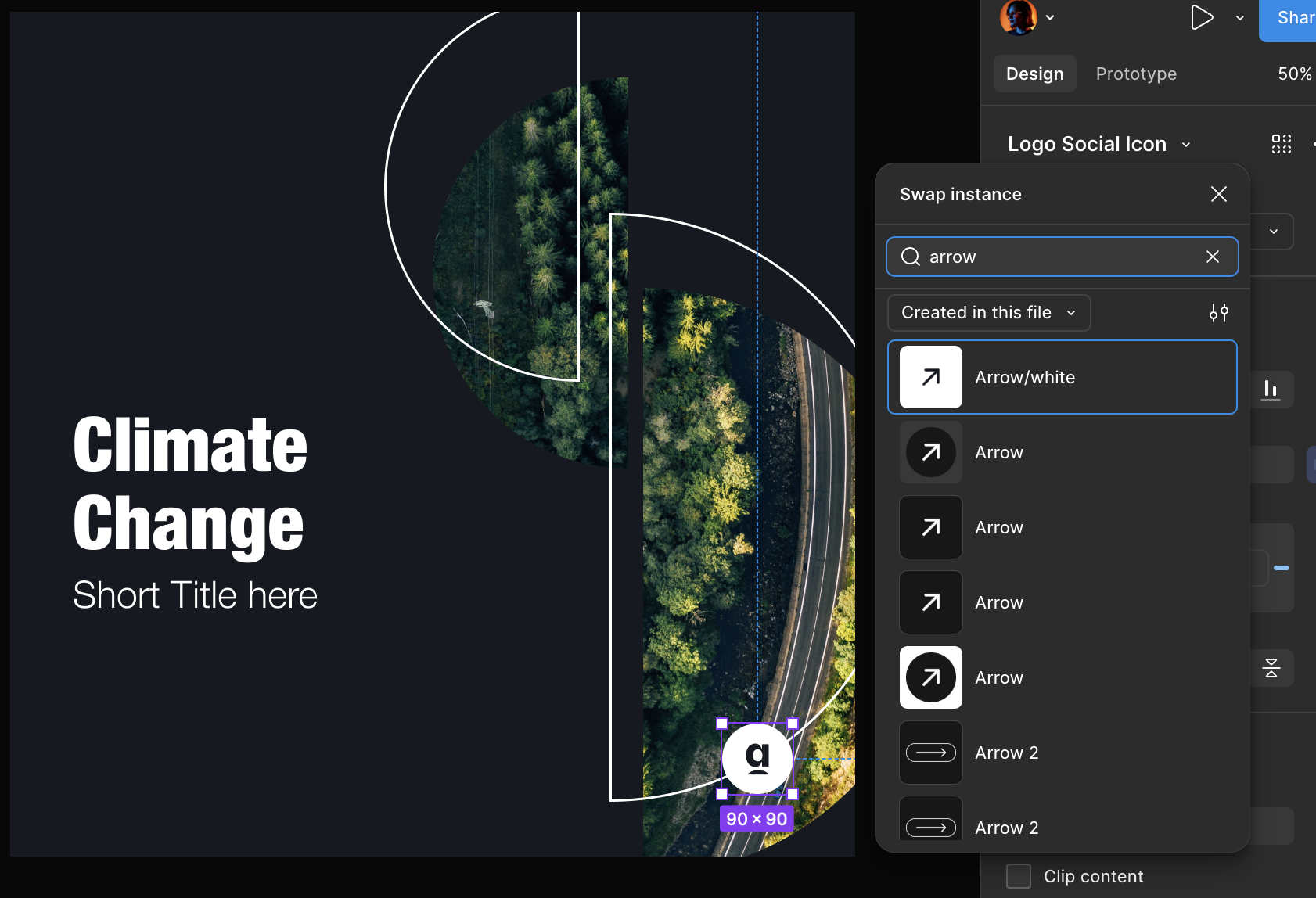
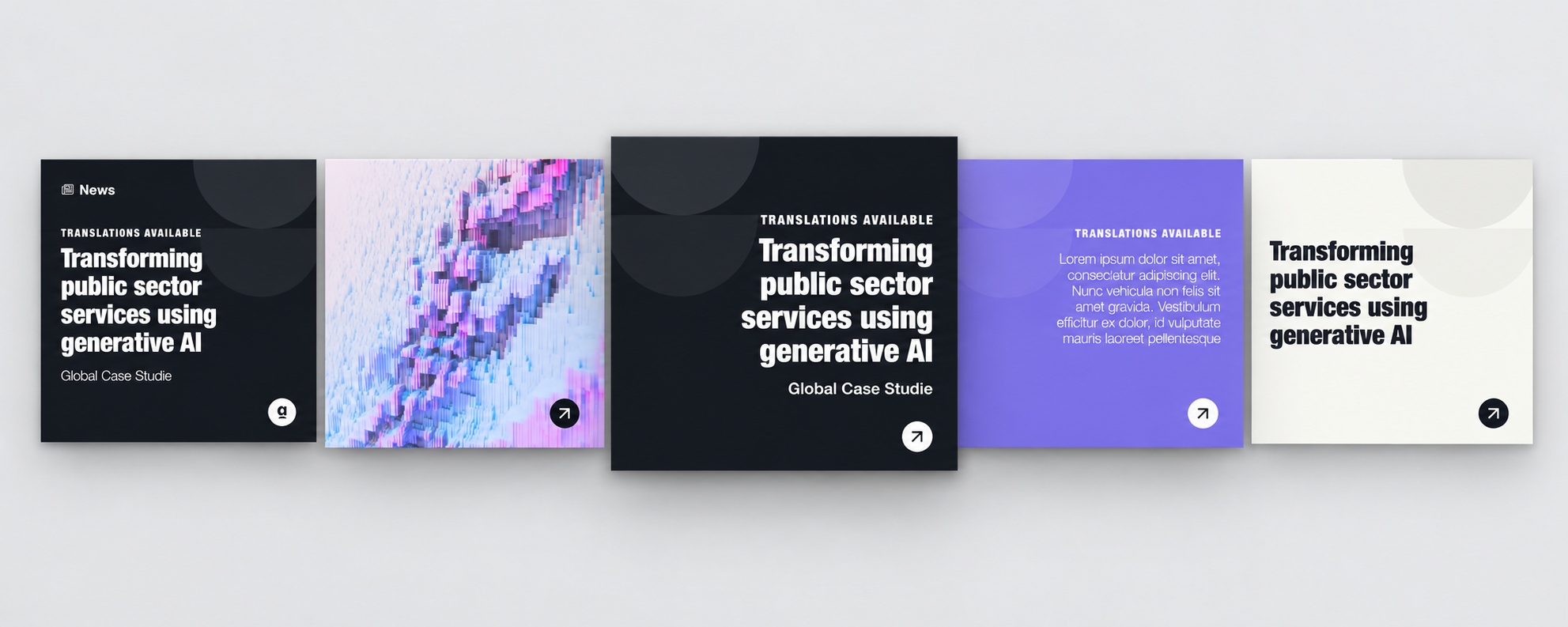
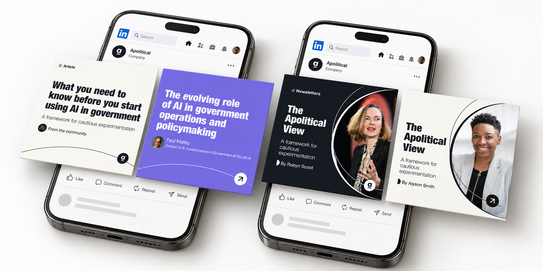
On top of the foundations, the library covers 10 content categories the marketing team actually publishes regularly: News, Courses, Keywords, 100 Lists, Article, Newsletter, Event, Hiring, Announcements, and Communities of Practice, each with several validated template variations. Contextual guidance sits right next to each variation (text/image contrast rules, when to use a background image versus a solid color, how to swap logos or images), and multi-frame carousel posts follow a defined pattern: the logo shows up only on the first and last frame, with an arrow motif signaling continuity through the middle frames.
That combination, governed components, embedded documentation, and an onboarding layer for non-designers, is what made the system genuinely self-service.